Showing posts with label Similar Product Research. Show all posts

Thursday, 17 November 2011

Both: Similar Product Research: BBC Magazine Language.


Issue: February 2009

The language used in BBC Music Magazine has a very educated, formal and mature tone to it. It has an incredibly extensive vocabulary, using words such as 'pizazz', 'plangency' and 'émigré'. This shows that the producers of the magazine expect their readers to be both mature and educated. Also there are no colloquialisms in the text, as this would lower the formality. The double-page-spread uses a mix of simple, compound, and many complex sentences - several of which have massive lists, such as in the first paragraph where it recounts all of Priwin's high profile celeb friends. The paragraphs are very long, and far from a tabloid journalistic approach. Lots of different punctuation is used, including colons, full-stops, capitals, semi-colons, apostrophes, quote marks and brackets. Again, this is because the target audience is able to understand these different symbols, and know what they mean. It is also worth noting that any other magazine titles and album titles are italicised to highlight them, and to make it clear they are other titles. 

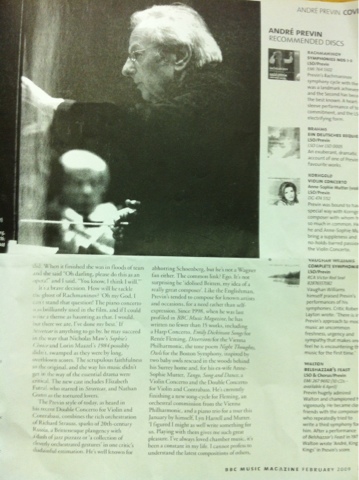
 The article often uses allusions and what is colloquially referred to as 'name-drops' to give a brief biography of the artist, and show that other high-profile celebrities of the day were good friends with him - such as Julie Andrews. The whole article is almost a mini-biography of Prewin, and gives an overview of his career. Interspersed in the article are several embedded interviews, many of which are from Prewin himself. The article is very long, as it takes up the bottom of the entire double page spread, and it has been continued from the page before and it continues onto the next page as well. This shows how in depth the article is. All of the embedded quotes are in past tense, whilst the article is in present. This makes the article more involving to the reader. 'We' is also used to replace 'I' often. This could be because they want to show the entire magazine agrees, or it could also be another technique to involve the reader. To increase believability and legitimacy of what they are saying, they often use quotes from other interviews to reinforce a point.           

Thursday, 6 October 2011

Chad: Similar Product Research: Mojo Magazine

December 2001

Mojo magazine uses a black, white and red colour scheme on every single issue. However the usages of the colors are rotated each month. They possibly use a red, black and white colour scheme because it is somewhat established and stands out. The black and whiteness of the photo also fits with how aged the photo of Michael Jackson is. Other popular magazines that include a black, white and red colour scheme in there house style include Q, and NME

Mojo has a white, bold, slightly playful spaced out Masthead. Like Clash, there is a red bar at the top with some extra cover stories and a picture. This highlights some more stories and separates them from the main story. Mojo has a sell line ("The Music Magazine")which is designed to look like it has been handwritten. The connotations of a fancy, handwritten font are that perhaps the magazine wants you to believe that real people agree that it is The music magazine, and it isn't just the company trying to sell you something - even though it is. The magazine seems to cater to all genres, which could be because it wants to make its target audience as large and as diverse as possible, or because it knows people do not just listen to one genre unless they are extremely narrow minded.

The picture of the magazine fills most of the front cover, leaving no blank space, and there are relatively few cover stories on it, the main one being about the rise and fall of Michael Jackson. His name is in a white, grungey, printed style font which also seems quite retro. The tone seems quite professional, and there is no sensational writing. All of the text is on top of the Michael Jackson portrait, which could be to make the magazine seem more important than he is. The shot of Michael Jackson seems to be a smiley, press shot from the 60's, which was the peak of his career.

From this magazine we will use the technique of rotating colours each month; the simple sell line; the slightly more mature target audience; the multi-genre nature of the magazine; and the professional tone

Wednesday, 5 October 2011

Chad: Similar Product Research: Clash Magazine


Issue 42

Issue 42 of Clash magazine uses an incredibly simple colour scheme of monochromes and gold. This is probably because it suggests the cover star (Jay-Z) exuding opulence, as gold and silver both have connotations of precious metals, and of being very expensive. This also ties in with the fact that Jay-Z is one one of the richest musicians/ producers in America, plus it suits his dark skin tone much more than it would suit pale skin. In addition, it makes the magazine seem much more mature and stylish compared with if it had been full of bright colours. It does seem rather masculine though, but, now I think of it, a lot of major music magazines do.

There is a white magazine logo masthead in the top left corner of the magazine. The magazine title is is a curvy, modern, sans serif font that is similar to all the other text other than it being more curvy, bigger and more stylized. There is a bar at the top with some an extra cover story on. All of this is the house style - the colours, content, and cover star change every issue.

Whereas on most music magazines, the cover stories take up and fill most of the blank space, on Clash the portrait does, which is unconventional.The cover stories that are there have headings that are bold, to add emphasis. The tone is slightly sensational ('Reveals All!'), and they use exclamation marks a little too readily, to make it seem exciting! Hmmm...

All of the text is on top of the moody close-up of Jay-Z which is conventional, and is possibly to show that the magazine is more important than him - or it could just be to make everything seem simpler, and more organized. The fact that he is in a moody pose makes him seem a lot more serious, powerful and masculine.

The magazine does not seem to focus one genre, as it features both a hip-hop modern megastar - Jay-Z, but refers to a Classic pop band - The Beatles. This could be to have as wide a target audience as possible, or because it is trying to cater to an audience who are mature enough to have listened to the Beatles, but who also like to keep up with new music too.

From this magazine, we might use a similar simple colour scheme; a similar simple logo; modern sans serif typefaces;  the usage of boldness to emphasise stories; and the multi-genre focus.

Monday, 3 October 2011

Callum: Similar Product Research: NME

 February 21st 2011 Edition

This NME features the redesigned house style that the magazine recently adopted.  For example, the masthead is no longer red with a white inline.  The font is Sans Serif and each issue it rotates colours (white, blue, pink etc.) with this issue being white.  The new style makes the magazine seem more grown-up, important and less tabloid-y; possibly in an attempt to recapture the readers it has slowly been shedding over the past few years.

The colours that grace this front cover are purple and white, which fit the new house style and easily separate the headlines from the strap lines.  The text of the entire front cover is entirely in a Sans Serif font.  However, the cover story is italicised for emphasis (plus the Graham Coxon quote).  This continues the newly professional layout of the magazine.

The barcode is in the bottom right hand corner with the price and date included on it to keep it from clashing with the rest of the magazine's front cover.  The price and date are reposted in the top left hand corner of the cover above the logo, however their size is much smaller than the logo.  This makes it very easy for the customer purchasing the magazine to know at a glance whether or not they're picking up the latest edition.

Parts of the logo and sell line (New Musical Express) are obscured in the picture by the band in the shoot (the photo overlaying the logo and sell line).  This assumes that the reader is familiar with the brand of NME (seeing as they've been around since the 50s) and shows how important the band on the front cover are (seeing as the are important enough to block most of the magazine's identity).

The mode of address is very informal and sensationalist.  “Graham Coxon spills all” and using quotes pulled directly from the articles without any context to them, for example.  Regardless, they definitely do attract the reader's attention and it definitely interests those who want every single bit of gossip on their favourite band.

The cover has very little blank space with text and stories taking up just about every possible space.  This can cause three impressions.  1] That the magazine is fit to burst with stories and content, enticing the reader into believing £2.30 for a weekly magazine is value for money.  2] It's professionally laid out so that only one major story overpowers the others.  Or 3] Some may think it looks a bit too cluttered and messy and possibly too text heavy.

(note: The outer white line does not appear on the actual cover.  I know.  I own that issue.)

From analysing this cover, we will take from it the ideas of  using italics to emphasise stories; and the newly mature tone.