Photo Shoot 2, Contents Page

I rejected this image (DSC_1927) because the horizon was extremely off centre and the subject is a bit out of focus. Plus, the rule of thirds wasn’t particularly well adhered to.

I rejected this image (DSC_1952) because the shot was, overall, extremely out of focus. The further away the image goes, the more out of focus it became. Plus, the weather conditions (specifically the lighting) don’t fit with the issue that I am planning. It’s kind of a shame, seeing as I feel there was good framing here.

I rejected this image (DSC_1939) because there was nothing in the shot that was in focus. Plus, the horizon was off centre and the model staring straight at the camera looks weird when looking back through the photos.

I rejected this image (DSC_1930) because the horizon is rather off but also because the image is slightly too dark and there’s this weird dot and line all the way down my subject, even though it wasn’t there on the camera (or, if it was, I wasn’t aware) when I took it or physically on his person. Because of the subject’s face, it’s almost impossible to remove in Photoshop.

I rejected this image (DSC_1921) because little of the image is in focus and the sky is a bit too bright for the issue. Whereas the sky can easily be corrected in Photoshop, the blurry image cannot.
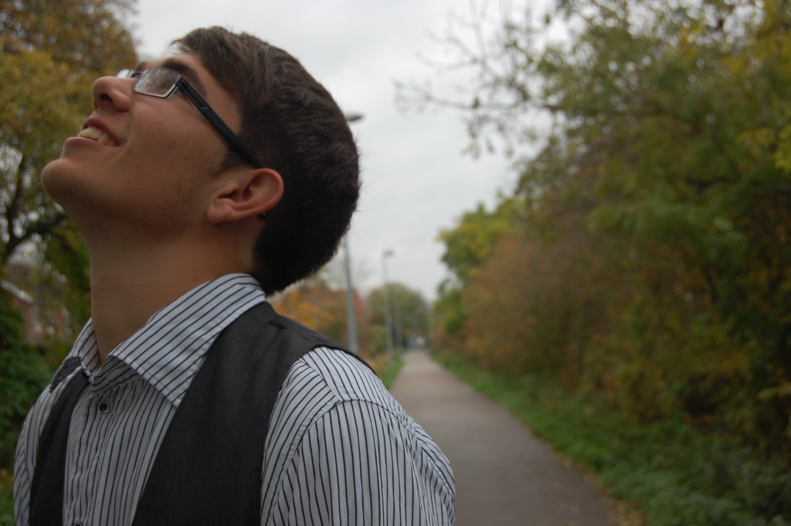
I rejected this image (DSC_1932) because it was, conversely to most of the other photos, too dark. This is in addition to the horizon being off centre and that weird dot is back again.

I rejected this image (DSC_1943) because there is too much blank space on the image. Everything else is perfectly fine, but there are also better photos. Plus; trying to crop image would just leave the resulting image out of proportion.

I accepted this image (DSC_1931) because the subject is perfectly in focus and the rest of the image is artfully out of focus. It’s close to the approximation from my draft of my contents page. I can tidy out the rough edges (the weird dot, for example, doesn’t interfere with the subject in the image and, for once, is barely noticeable) in Photoshop.


Photo Shoot 1, Contents Page

I rejected this image (DSC_1806) for the very simple reason that it is too blurry. It looks like copious amounts of vaseline has been rubbed on the camera and that both was not part of the photoshoot idea and unfixable. It's a shame, because the blocking for a contents page shot was actually rather good.

I rejected this image (DSC_1813) because of several reasons. The subjects aren't in decent focus, the horizon is off, the lighting is far too high key for the shoot, the flash was on and there are shadows coming off the edges of each of the subjects. In short, unsalvageable.

I rejected this image and several others like it (DSC_1834, DSC_1837 & DSC_1838) for the simple reason that the focus was misplaced. The camera was supposed to focus on the head of the subject sitting down and having the subject behind her being slightly out of focus. Instead, the camera focussed on the subject at the back of the photo and left the subject sat down extremely out of focus. This is not fixable in Photoshop and is a real shame because it would have brilliantly showed off a playful side of the band featured.

I rejected the image (DSC_1850). Whilst a lot of the image is great (the subject's are in focus, in shadow, there's a nice stream of light coming through the door, it makes a nice concept), there's a lock on the door and this weird metal object that throws the hard work of the shot composition out of the window. And since this is of a clear window with slight reflections, it's extremely hard to edit out in photoshop and, thusly, is rejected.

I rejected this image (DSC_1877) for two reasons. The first is the fact that the subject in the foreground is slightly too well lit for the photo. The second is the background, which is too in focus and I do not have an adequate explanation for including. If I'd done it against a completely black or white item, I could've edited the subjects out of the shot and placed them with a more suitable background, but as things stand, this is being rejected.

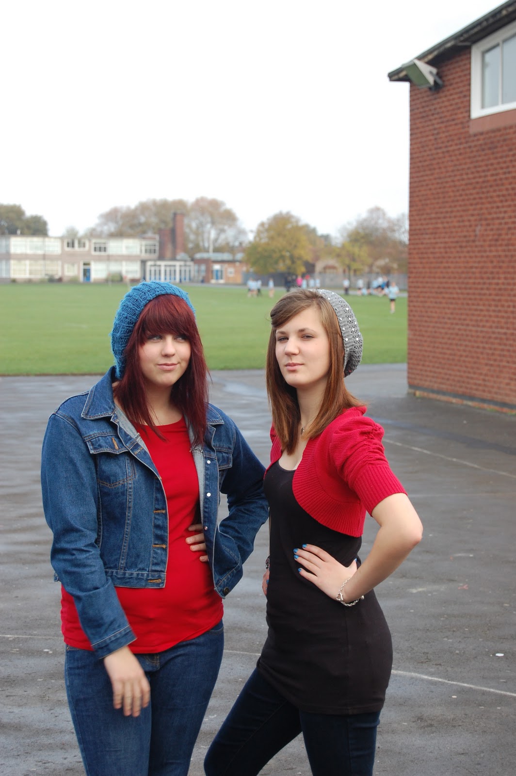
I accepted this image (DSC_1872) for my contents page shot. The way that the image slowly becomes blurrier and more out of focus as it goes on looks great and keeps both subjects in focus (the first subject coming off much sharper whilst the second subject is still relatively in focus, only looking blurrier due to the photo slowly getting more out of focus). The red on both subjects pops off and compliments each other. The background is out of focus enough to make it not at all matter where they are because you are focussing your attention more on the subjects. There is a little bit too much blank space (the sky) but this can easily be fixed by cropping in Photoshop. It's perfect for the contents page.
Front Cover

I rejected this image (DSC_1848) for two reasons. The first is that there was far too much blank space in the image, even for a front cover shot. The second is that the door doesn’t take up the entire background. It cuts off randomly and screws up the colour scheme of the image. If I’d taken it right (and taken it without the reflections, I could have cut the subjects out of the background and inserted them somewhere else. But I didn’t. So I can’t.
The major reason I rejected this image (DSC_1867) is due to the background. I, stupidly, chose to take this shoot during lesson which meant that there were tonnes of people unwittingly running into frame in the background ruining the shot. There was also too little space on the front cover to wrap the text around. It’s a shame because, for once, the horizon is straight and the subjects are in focus.

This image (DSC_1868) was rejected largely for the same reasons as the previous one. However, it’s also a little too dark for the front cover. As in, the shot isn’t particularly bright enough and the two subjects are too muddy (as in colour, not genuine mud). Plus, the text would be far too top heavy of the cover on the magazine.

I rejected this image (DSC_1882) because it does not adhere to the rule of thirds, there isn’t enough room to put text on the cover and I don’t have any particularly good reasons for having a collection of houses in slight focus in the background. The horizon is relatively straight, the lighting is particularly good and it would have made a good contents page image, but I’ve already chosen my contents page images.

I rejected this image (DSC_1904) because of multiple reasons. The first is that the horizon is not that straight. Second is just how far away the shot was taken. It creates too much distance between the reader and the band. Third is how the subjects aren’t particularly in focus. Fourth is the fence that crops up in the background of the shot, ruining the composition. Finally, there’s the fact that there’s too much blank space on the shot and this means that the front cover would need an inordinate amount of text to justify the image.

I accepted this image (DSC_1905) because it’s a good encapsulation of fixing all of the problems of the previous shots. There is nothing in the background that shouldn’t be (the fence is barely noticeable). Both of the subjects are in focus, well lit and in frame. The rule of thirds is adhered to (one subject in the right third, one subject in the middle, background in the left third). One of the subjects has their hair being blown by the wind which adds a sort of action effect to the shot. And there’s enough room to put text, but so much that the cover would have to become text.


